.png)
.png)


Aim
-
Update the user interface to enhance the experience, particularly for older users (50+), by simplifying navigation, information search and service ordering.
-
Develop a unified system that allows easy access to burial site information, requesting details about the deceased, and ordering maintenance services.
-
Personalise services to strengthen the connection with users and make the process of ordering grave care more meaningful.
-
Optimise the UX/UI design, based on research and surveys to make the sites more user-friendly.
Project
Analyze the existing website and improve the accessibility and management of services offered by cemety.lt for users through new UX/UI decisions.
UX/UI audit and design
CEMETY.LT
ABOUT CEMETY.LT
PROBLEM
The old system for organising and archiving graves is inconvenient, outdated and inefficient.
There is no single, all-encompassing register where people can find out exactly where a loved one is buried and in which cemetery, and quickly and efficiently find all the information they need.
SOLUTION
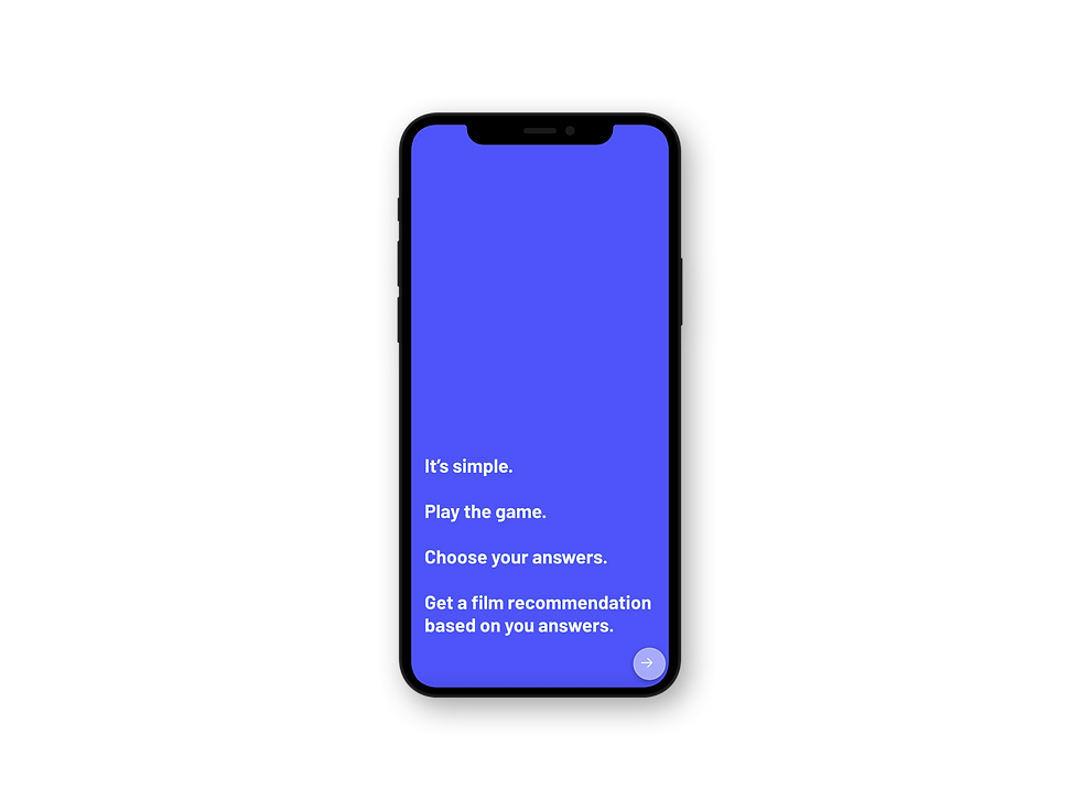
Create a system that would filter films and pick one final option.
CONCEPT
Create a game system from a set of questions that would help the algorithm filter through thousands of options of films and present the most accurate result based on the input answers.
2890FF

Name:
Evelyn
Age:
27 years old
Interests:
Going to cultural events, reading, hiking, cooking.
Occupation:
Event curator
Region:
South West England

PERSONA PROFILE:
formed from research and interviews
INSIGHTS
Create a system that would filter films and pick one final option.
It usually consists of:
-
Genre
-
Release year
-
Duration
-
Average rating
-
Language
Using the same system often means very similar results: narrowing down the list but still leaving plenty of options to choose from.

APP:
Taste- Movies & TV
First, the app gives a quiz to calculate the taste. And based on the answers, it personalises ratings and reviews to make a selection of the most suitable films.
It is kind of a ”film tinder”, where people have to swipe left or right. The app uses several collaborative filtering algorithms to suggest what to watch.
The match % for each movie and show measures how much a person would enjoy a movie.
INSIGHTS:
Despite giving even more options on how to choose films this app still doesn’t provide the final suggestion, and the end choice must be made by a person.


APP:
Popflake
The app suggests limited themes/topics, which helps to narrow down the choices.
There is also a search option, which gives a limited amount of words to describe a movie. Later based on those words top selection of films is presented.
INSIGHTS:
Even though the idea of the app is definitely more efficient than most of the others, the final choice still has to be made by users themselves.

APP:
What to watch: Movies
Search from various streaming services included.
A set of questions is presented with limited answers (to help make the choosing process easier).
INSIGHTS:
Based on the answers the list of films is presented. And still, the final choice must be made by a person.

APP icons
These 4 symbols of films/videos are the most commonly used shapes for the designs of app icons that are related to films/videos.
Also, red is quite a common colour to use for designs associated with films/videos.
INSIGHTS:
The symbols in all of these apps icons clearly indicate an instant connection with films, but for FILTER icon design I want to step away from the commonly used symbols and create something different, to step away from both the usually used symbols in design and provided searching systems.

MARKET RESEARCH:
Questions that the algorithm would be based on.
If the film was…
-
a colour, what colour it would be?
-
weather, what weather it would be?
-
a game, what game it would be?
-
a texture, what texture it would be?
-
an animal, what animal it would be?
-
a sound, what sound it would be?
-
an emotion, what emotion it would be?
-
an element, what element it would be?

To test how the algorithm would be formed a conducted a survey on 3 films and asked people who've seen them to answer these questions. I wrote down the data that I've gathered from the answers and surprisingly found quite a few matches between the answers of different people which proved that with enough data algorithm could quite accurately interpret the answers of the game and then based on that suggest a film.

A few examples and matches.
THE MAKING OF:
filtering system
KEY WORDS:
Focus points for brand language and visual identity.
Efficient
FUNCTIONS &
GOALS
-
Provide an alternative searching system for finding what film to watch.
-
Be minimalistic as a contrast to the surplus of choices.
-
Help to save time and energy.
-
Expand movie tastes by suggesting films that users might not normally pick themselves.
Minimal
Fun
Helpful
I identified the main points of user flow that would meet the needs, desires and main goals of a user. I presented the flow in a diagram to show what the user journey would look like from discovering the app to navigating through it and reaching the end result.

USER FLOW
Visual inspiration came from the name and the concept “FILTER”; the app is supposed to work as a filter to sift through films and select one final suggestion. A visual of a usual filter as a sieve of mesh inspired the pattern of the logo.

BRANDING: logo

.png)
.png)
UI KIT
FINAL UI DESIGNS


